Visual Design | Branding | Illustrations
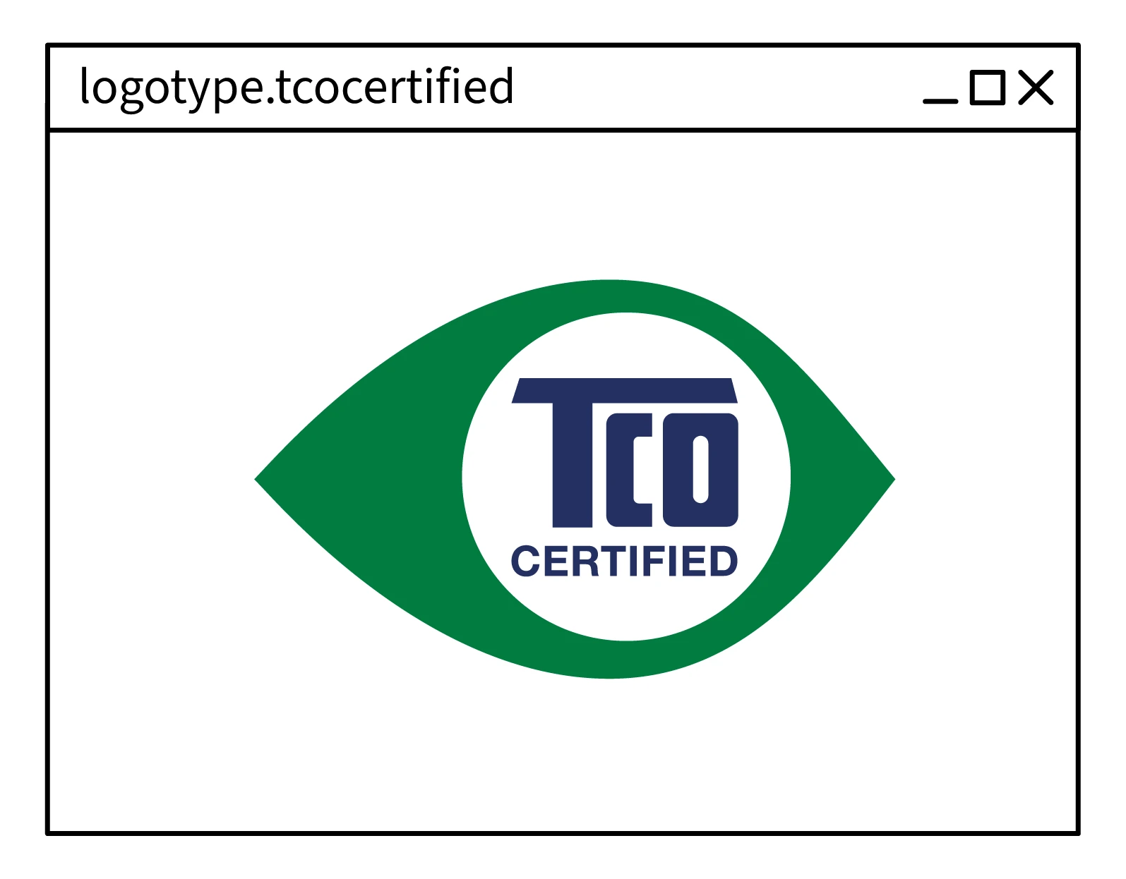
TCO CERTIFIED, VISUAL IDENTITY
TCO Certified is a sustainability certification for IT products. With comprehensive criteria, it is designed to promote social and environmental responsibility throughout the product life cycle.
Over the years, we have refined and defined the visual identity to help us reach out to the global market with TCO Certified. Below is a walkthrough of the most important aspects of the identity.
Client | TCO Development
Team | Andreas Langer, Cassandra Julin, Dennis Svärd, Gabriella Mellstrand, Malin Russell, Peter Knochenhauer Bengtsson.
My role | I led the continuous development of the visual identity for TCO Certified. Collaborated closely with sustainability experts to translate complex environmental challenges into data-driven reports, infographics, and visual narratives.

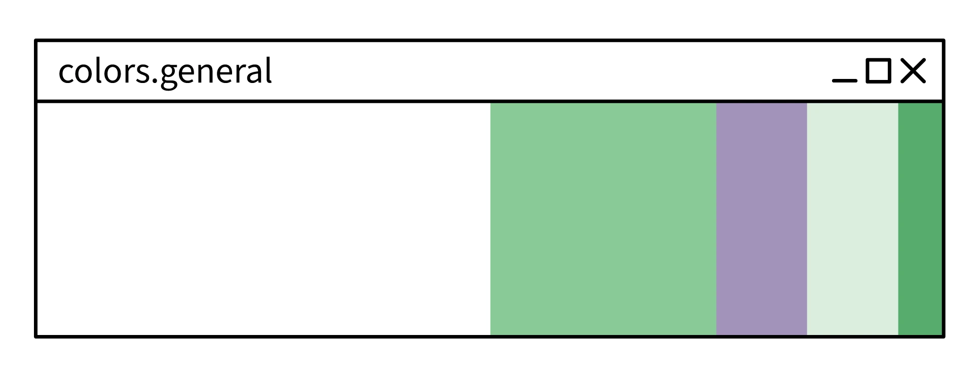


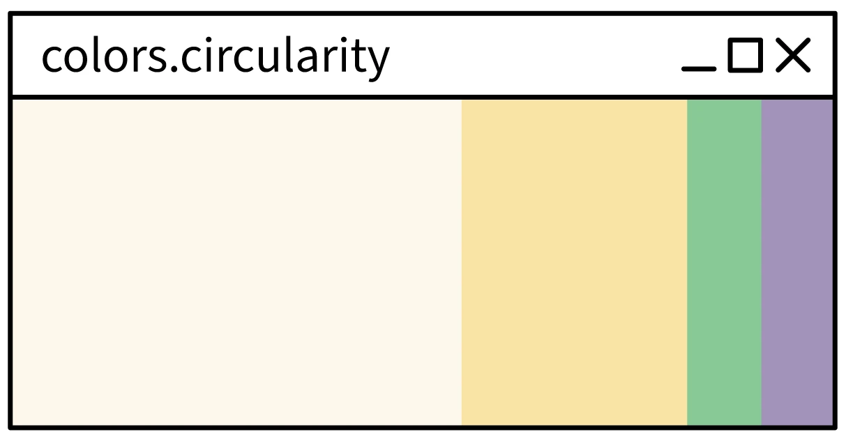
TCO Certified addresses sustainability across four interconnected areas: climate, substances, circularity, and supply chain. The problems and their solutions overlap, tackling one area strengthens progress in another. Underscoring the need for a holistic approach.
Each area is assigned a distinct color in our palette: blue for climate, red for substances, yellow for circularity, and pink for supply chain. These colors guide navigation while maintaining visual coherence by incorporating our brand's accent colors—green and purple.


The system is applied across all outputs, from compilation guides to in-depth articles and criterion walkthroughs.
Icons are used to reinforce the visual narrative. Paired with shallow-depth photography of people in office environments or in IT product lifecycles, they create a distinctive visual language, anchoring the imagery and making it distinctly TCO Certified.
The same approach applies to employee imagery, with icons highlighting the specific topic or area connected to each photograph.
An important part of the graphic elements is also how digital and electronic elements are used, for instance here, a digital window.

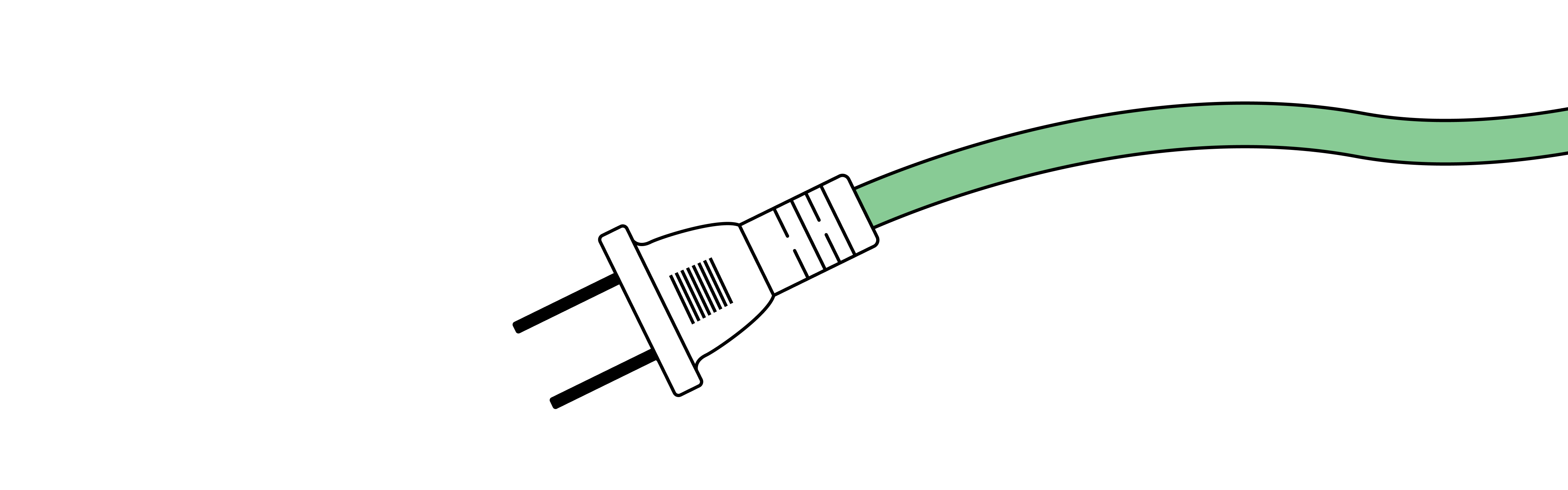
Cords, plugs and outlets are also used in the same way. It serves as a way to showcase both the part that connects all IT products and the global aspect of the certification. For instance here highlighted here by different electric outlets

Designer – Rasmus Bengtsson
hello@rasmusbengtsson.com
Linkedin
Selected work
Barnacle / The independant burger